Let's Talk About Sketchbooks Volume 8

It has been so long since I've had a sketchbook to share. 

I have really gotten away from art journaling in the past year when I started to work on loose sheets of paper or tearing out pages from my sketchbook to scan. This shift is mostly great because it means that I'm focusing more on making work that I can sell and developing my digital skills with scanned-in work. But I really miss making art that lives in a book and the more personal work that comes out when I'm art journaling is so valuable to me. I made a point of getting back into it in the last month or so and it has been great. 

sketchbook 8 cover

So here's the book. It's a Moleskine cahier that I started in August 2016. When I was almost finished I painted the cover white (covering up a pink paint job that I did not like, which you can kind of see showing through) and added this rad Nefertiti sticker from Salad Days Pins.

I started this book as a place to use up extra acrylic paint but dropped that plan almost immediately when I decided to use it as an art journal instead. These first two pages reflect that original purpose, plus some extra doodling.

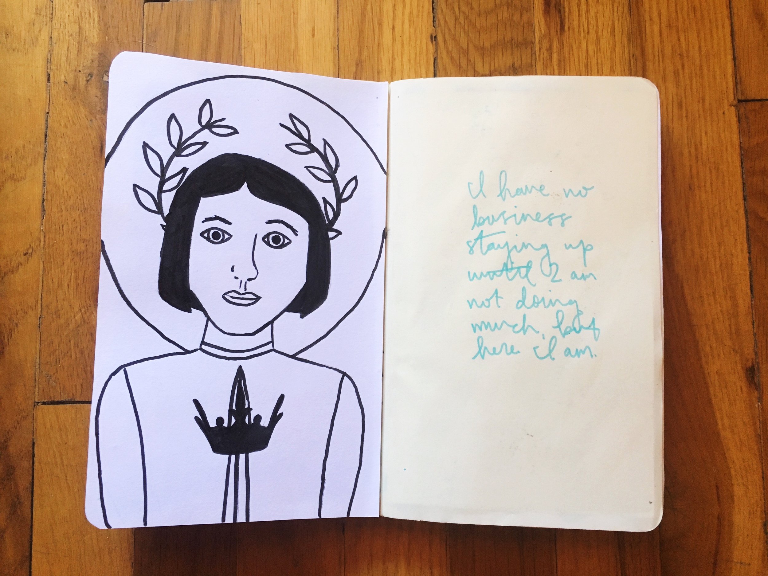
The pages in this book are actually very thin, so in many places I stuck pages together or added mixed media paper on top of the page to give it some more heft. The drawing on the left (of Joan of Arc, naturally) is on mixed media paper that I glued into the book.

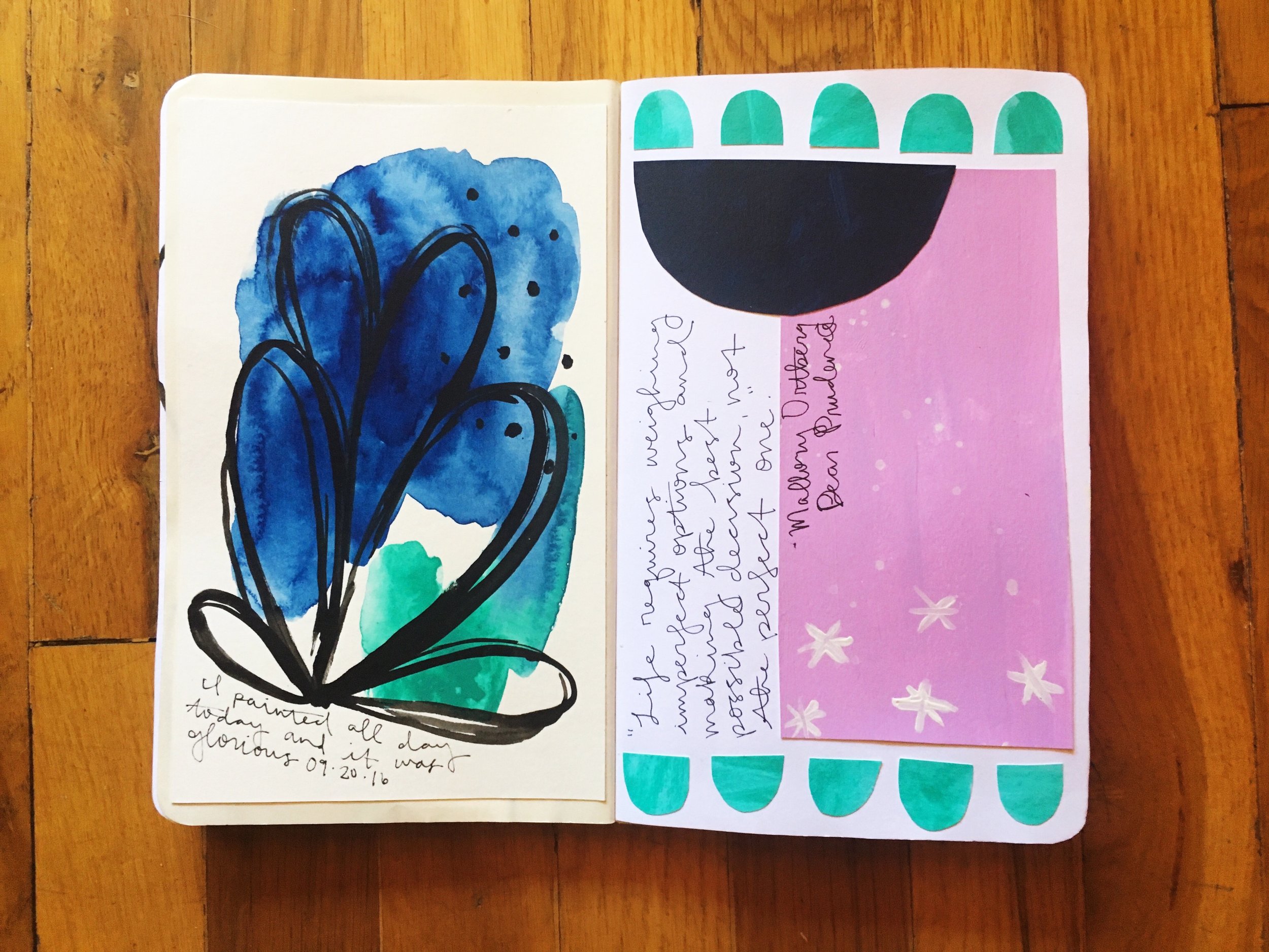
Because I was working on so many projects on loose paper I tried to use the book as a place to keep some samples of what I was working on at the time. The painting on the left is one of a series of watercolors that I pasted in. The page on the right is heavily inspired by Katie Licht's Cut and Paste class at Studio Calico, which I was taking at the time. I am such a fan of Katie's work, so getting to learn about her process was amazing.

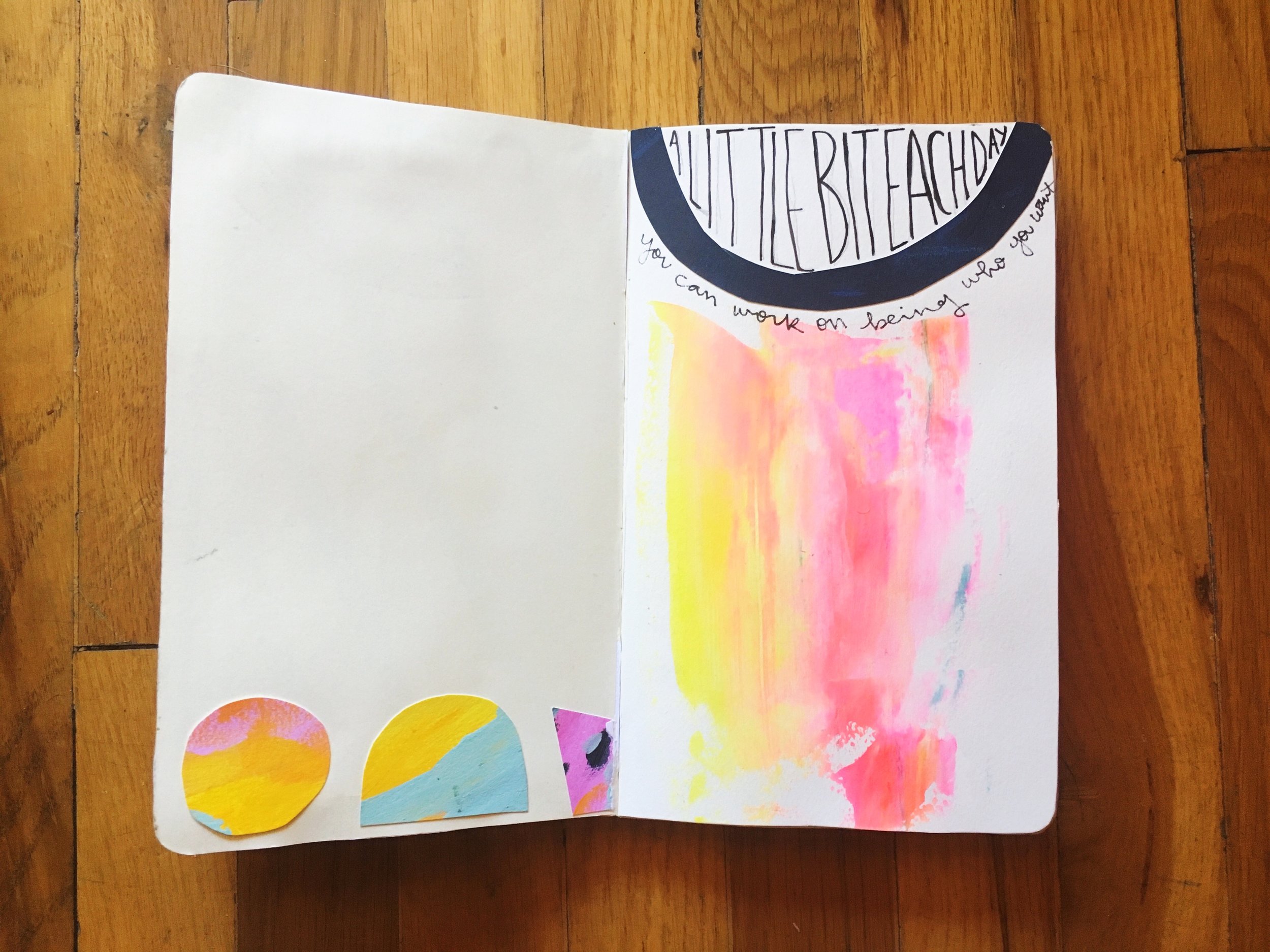
This is a completely unfinished page. I tried out a few ideas and didn't feel the need to continue with either of them, so I just left them that way.

On the left is another Cut and Paste inspired page, using papers that I painted. On the right is another collage using paper that I drew patterns on myself (the eyes are a rubber stamp that I carved years ago - you can see it in use in a different journal here).

More Cut and Paste inspired pages, this time with a more minimal approach.

I had intended on journaling on this whole spread, but I never did. Now, I like it the way it is.

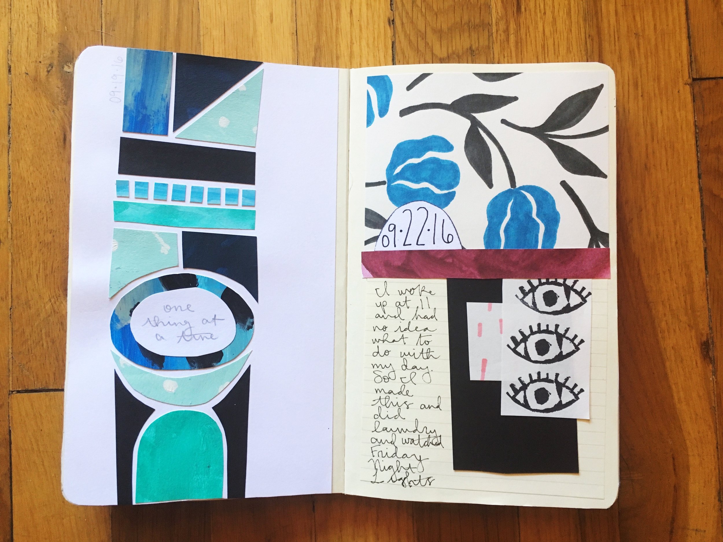
I liked the way that these 3 pages worked as a spread. I cut holes into the blue page on the right so that the polka dots on the page behind it show through.

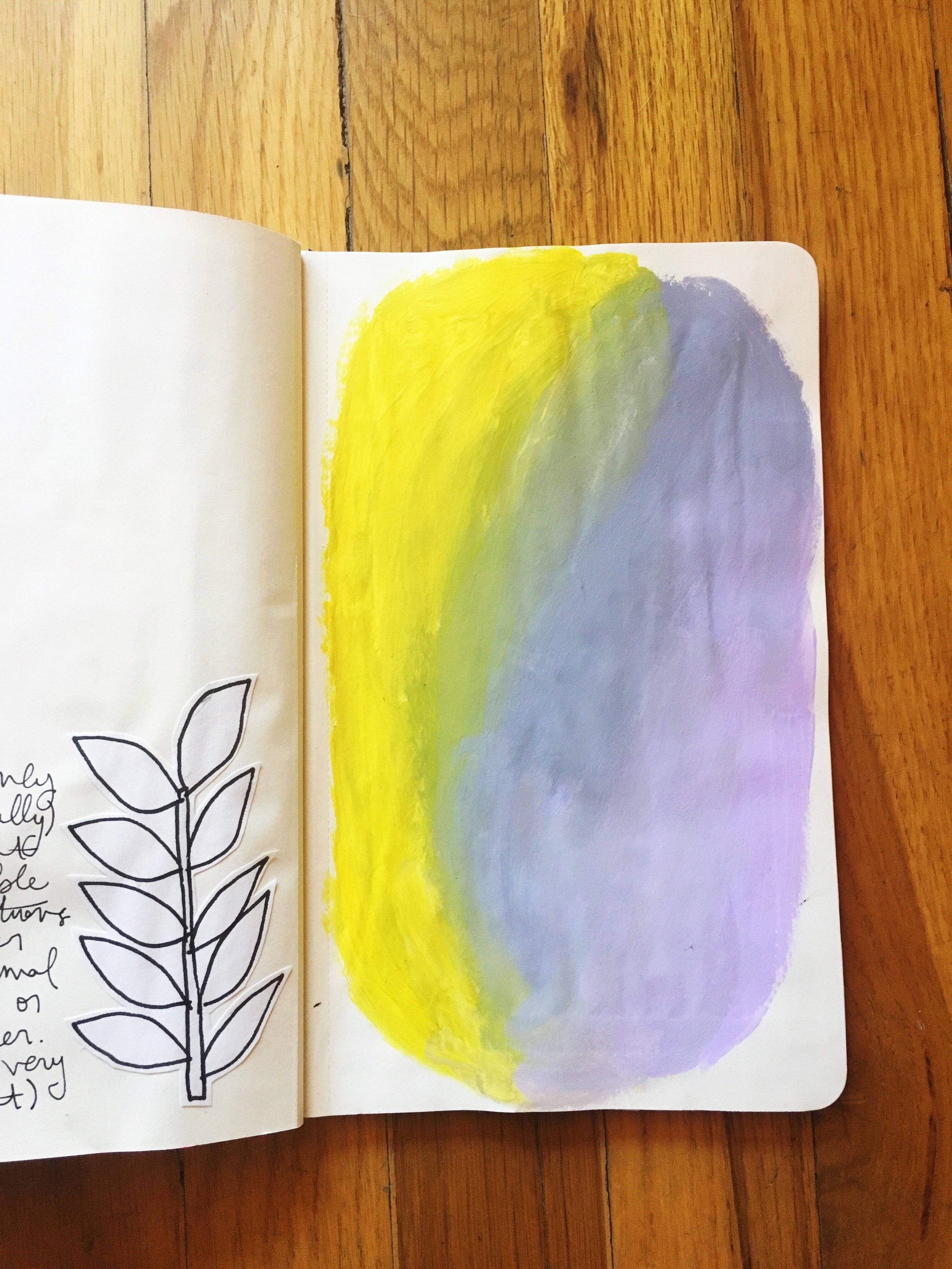
More collages, using papers that I painted myself. This blue, green, and yellow color scheme is different for me, but I love how it looks.

More examples of what I was working on. I was scraping layers of paint onto paper using a credit card, and then painting over it so that the layers show through in the negaative space.

More collages that didn't work out so well and a pattern that I love in pink.

More examples of current work that I glued in. This was an early study for what would become a series of abstract watercolors that are now in my shop

One of the drawings from my Draw a Lady Daily project. I did most of them in other notebooks, but one day this was the only one I had with me. When I closed the book, some of the paint marker rubbed off on the opposite page, so I covered it with a pattern.

Trying to get back to journaling like I used to, with lots of bold lettering. And another scraped paint background on the right.

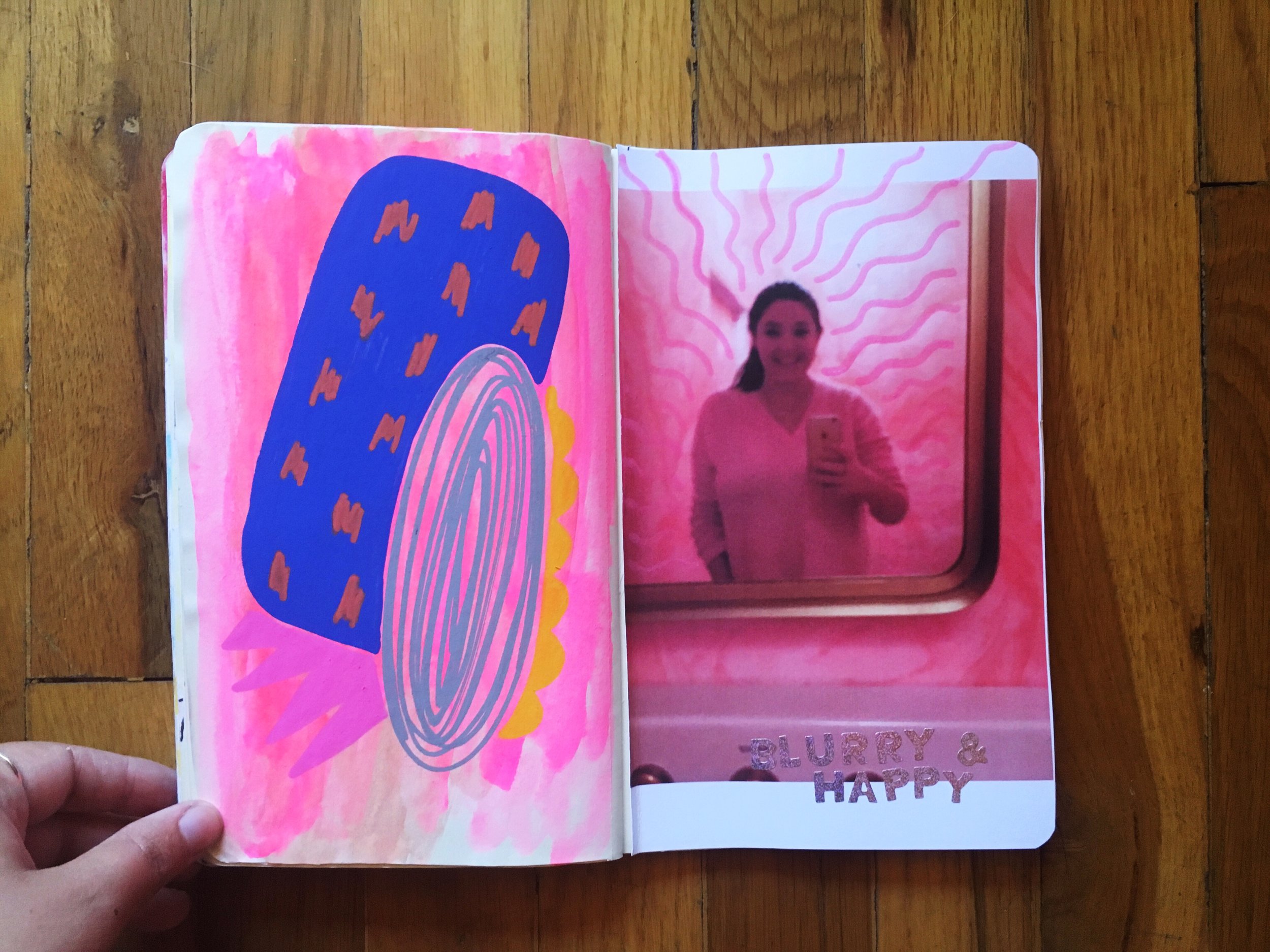
I have loved incorporating photos into my journals and doodling on them. What I tried on this photo turned out looking more like stink lines though. The stickers say "blurry & happy" because that's what I am in this photo. I'm trying to remember that I can be happy even when things are blurry.

Practicing mixing acrylic colors. And some minimalist collage.

IMG_0643.jpg

More color mixing practice, paint pen doodling, and the Mary Oliver quote that I want everywhere.

The evolution of a pattern. I doodled the big eye when I didn't know what to draw and then decided to make it into a pattern.

More paint pen patterns.

Thanks for checking out my sketchbook! If you share your sketchbook or art journal on your blog or Instagram or wherever, let me know, I love peeking inside other people's sketchbooks. Hopefully it won't be so long before I have another sketchbook to post.

Let's Talk About Sketchbooks Volume 5

This week's sketchbook is actually one that is still in use (kind of). I got this book just under a year ago on a trip back to Massachusetts. I was in a little bit of a journal slump (I had started my 2015 daily drawing project and was spending most of my art time working on those drawings, first on white loose-leaf paper and then in a 100% boring sketchbook (not included in this series because all of the drawings in it are already on my Instagram page as part of that project)). After I finished my last journal I didn't pick up a new one for a while.

Then, I saw this journal in Paper Source and it was love at first sight. I loved the exposed binding and the pages of color swatches at the start and end of the book.  I loved how chunky it was. I loved the green cover, even though green isn't usually my jam.  So, I bought it and started dreaming about how quickly I was going to fill it up with tons of drawings and artwork. Almost a year later I still haven't filled it up, but this journal contains some of my favorite work (I think I say that about all of them) and got me out of a journal-keeping slump, so I think it did it's job.

This journal is made by Plum Goods and has a really cool exposed coptic binding made with pink thread that I am super into (although paint does leak into the binding). I customized the cover very simply by taping down a cut-out of my name and by letting it get super beat up. 

This journal was designed by Linda Geary who did a project with a bunch of color swatches, which are featured at the front and back of the book. They would probably make really cool backgrounds for pages, but I just let them sandwich my own artwork and serve as inspiration.

The first page references the fact that I had gone for a while without an art journal to dump my thoughts/feelings/artwork into. The idea that journals make me feel better that I keep coming back to. 

I started incorporating my daily drawings into the journal, instead of making them as their own separate project. I drew the anatomical heart out of a book about cardiovascular health that I found at my grandparents' house, photographed it for my project, and then added the writing later.

On the left I painted over a random pen drawing that I didn't like. I won a zine from Natalie Mutrux and in my package she included an envelope of ephemera. I made a contour portrait of the guy in the bottom photo and the photo in beside it on the right page. That black watercolor rubs off onto the facing page when the journal is closed. I try not to let it bother me.

I took myself out on a self-love date and went clothes shopping, to the art supply store, the book store and to sit and draw in coffee shops (where a lot of the drawings on the surrounding pages were made). Over the next few days I drew the things I bought for my daily drawings, including a bunch of Dr. P H Martin's watercolors, which I swatched on the paint bottle drawings.

More playing around with new watercolors.

As you can probably tell from the previous pages, I was doing a lot of life drawing at the time, hugely inspired by Danny Gregory. I bought all of his books that I could find right away and this was a favorite quote from The Creative License, painted with watercolor onto vellum and then pasted into the journal.

I took a bunch of notes while reading Amy Poheler's Yes Please and taped them in waterfall-style.

I think this was from a podcast? I should have written down my source, but I think I heard it when I was walking home and it just stuck in my head. Also, that pink is watercolor bleed-through from the previous page and it is so good.

Ugly and unfinished pages are all over this journal. 

Playing with stamps when I couldn't sleep (because of the coffee). Stamps are by Kelly Purkey.

Another example of incorporating my daily drawings into the journal. I drew the tiger and painted it teal and added the speech bubble with song lyrics later (lyrics are to Nanny Nanny Boo Boo by Le Tigre, obvs).

I went through an animals phase with my daily drawings and this is one of my favorites. 

In my last sketchbook post I wrote about covering up artwork I didn't like with lettering. It also works for angsty journaling too!

I fell in love with blind contour self portraits while working in this journal. 

I always felt like the space to the side of that lamp would be an excellent place to put something, but I never did...

When working with liquid watercolor I will sometimes use wax paper taped to cardboard as an impromptu palette (I know, I'm so professional). I love the way the wax paper looks after it has been used a few times, so I will often tape it into my journal (and, of course, more blind contours).

A lot of pages include my daily drawings and nothing else - also I worked on these pages completely out of order - the one on the right is from late June when I was preparing to move apartments, and the one on the left is from mid-July.

Lipstick swatches, because why not.

I really like the look of this page.

Travel journaling! This is from a trip to Montreal with a million delays. I don't really like the look of this at all, buy I collected a bunch of business cards and stuck them in and it was fun.

Mopping up excess paint.

Playing with patterns. Absolutely love the way this one looks with the pink thread used for the binding.

Even though I always intend to keep them art-y I always end up jotting down random things like packing lists in my journal - this one is for Portland!

Of course, the journal then came with me to Portland. I'm really into those polka dot letters.

Again, a lot of the pages in this journal have random one-off drawings in them. If I don't particularly like them or want to build a page around them I will just write directly over them.  It adds visual interest to a page with a floating drawing and gives me an spot to write stuff down (mostly just venting that I don't worry about being super legible).

Playing with drawing and watercolors on vellum. I painted the title of this piece - the moon-faced girl on the page behind the transparent vellum. Doesn't she look like those old depictions of the man-in-the-moon?

I still have quite a few pages left in this sketchbook (you can kind of see the block that is not as wrinkly/colorful in the above photo), but my work on it has kind of slowed.  When I started working in this book I was really excited about how chunky it is and had grand plans to finish it as quickly as possible.  Over a year later that has definitely not happened, and I'm less motivated to pull it out because I feel like the body of work inside isn't as reflective of where I am now. I'm not sure if I'll finish it off someday or just call it done. I guess that means I'm it is still in progress...